
Pairing gemstones isn't just about matching colors or chasing sparkle. It's a thoughtful process—an intentional blend of shape, light, and personal expression. This section helps you prepare in a hands-on and visual way, so each design goes deeper than appearance. It becomes a reflection of your own vision.
What You Need Before You Begin to Mix Gemstones
Before starting your design, gather the right tools and materials. Having everything in one place helps you experiment freely and stay focused. Think of this step as setting the stage for creativity.

Sample Gems, Color Tools, and Design Aids
Loose stones, color wheels, and gem trays make testing ideas easier. These let you switch combinations without committing too early. Try placing warm hues side by side, then introduce a cooler tone to see how the contrast behaves. Watch how light moves across each surface—it often reveals combinations you wouldn't have predicted.
Sketchbooks, Mood Boards, and Digital Planning
Sketching can give shape to vague ideas. Collect photos, textures, and color palettes that speak to you. Whether you're using paper or a digital app like Procreate, the goal is the same: to explore without pressure. Testing digitally helps avoid waste and gives your ideas room to grow.
Working with Settings and Base Metals
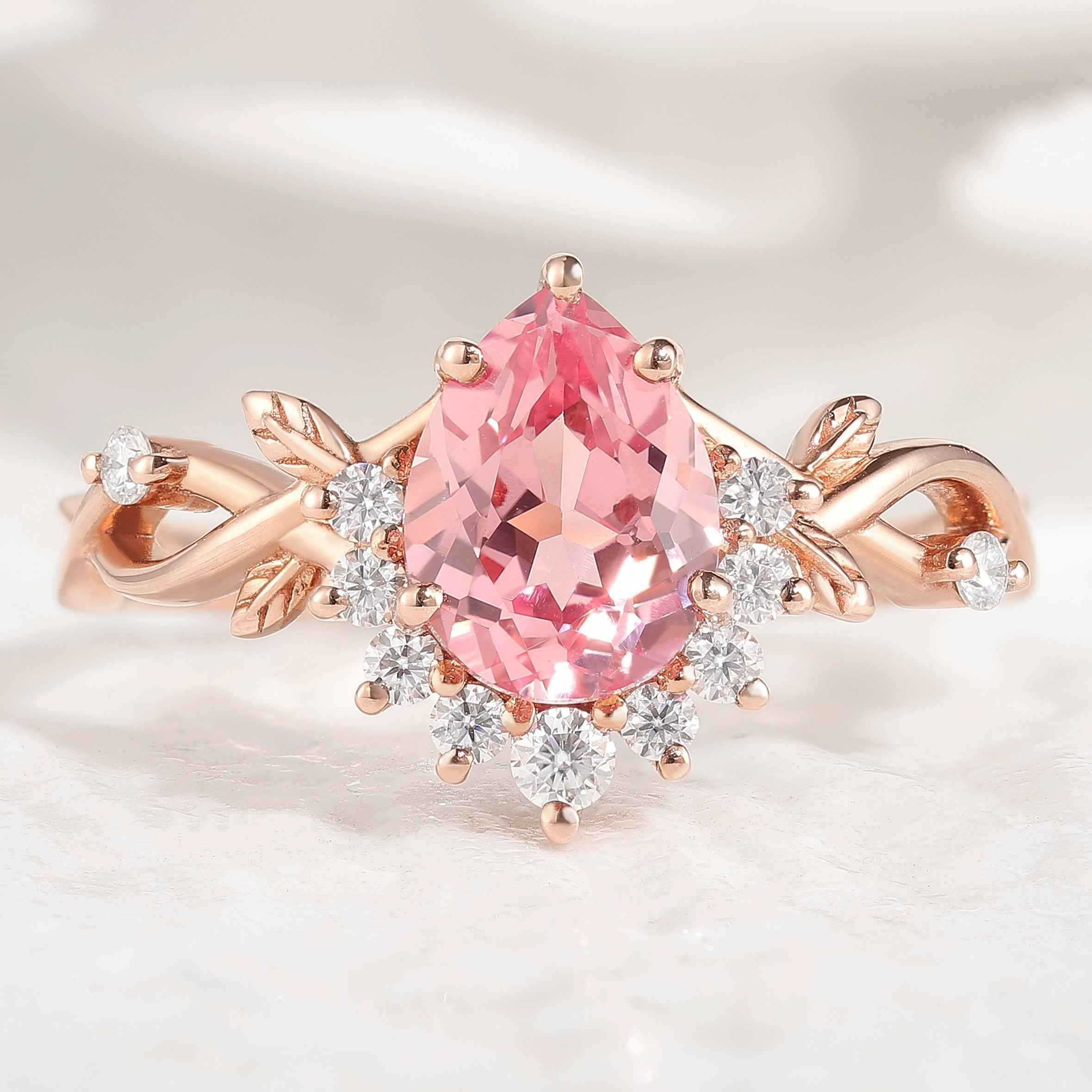
Metal settings are not neutral—they transform how a gem looks. Gold can deepen a stone's warmth, while silver cools things down. Try placing the same gem into different bezels or prong settings. You may be surprised—rose gold, for example, can soften an otherwise bold gem into something more subtle and romantic.
Color Theory for Gemstones Mixing
You don’t need formal art training to use color theory well. Some gemstone combinations just feel right—balanced, bold, or quietly beautiful. That’s rarely an accident. Behind those intuitive pairings are simple ideas that explain how contrast, harmony, and light interaction affect perception. A few of these principles go a long way when choosing gemstones that complement or highlight each other naturally.
Understanding the Color Wheel
The color wheel organizes hues so you can see how they relate. Some combinations contrast dramatically, while others transition gently. Test ideas by physically moving stones around a color wheel. Try a blue sapphire beside a ruby, then swap in an emerald—notice how the energy of the grouping shifts? That’s the power of placement.
Complementary Colors for Contrast
Colors opposite each other on the wheel—like the deep blue of sapphire and the fiery red of ruby—create instant contrast. This pairing pulls the eye through dynamic tension, yet feels cohesive when balanced. For example, setting a blue sapphire next to a ruby brings both stones to life.
Analogous Colors for Harmony
Analogous hues sit side‑by‑side on the wheel and work together smoothly. Emerald and aquamarine, for example, blend softly like waves of blue‑green. These combinations feel calm and grounded—great for designs that are peaceful, elegant, or nature-inspired.
Warm, Cool, and Neutral Tones in Practice
Warm stones like ruby or peridot bring glow and richness; cool-toned gems—such as sapphire or aquamarine—offer clarity and calm. Neutral stones—like moonstone or moss agate—can bridge these tones, giving your design space to breathe. When mixing bold colors, neutrals soften the impact while maintaining visual harmony.
Combining Gemstone Cuts for Texture and Flow
The shape and cut of a gem affect how it plays with light—and how your entire piece flows. Like instruments in a song, mixing different cuts creates rhythm and movement.

Different Cuts and Their Visual Effects
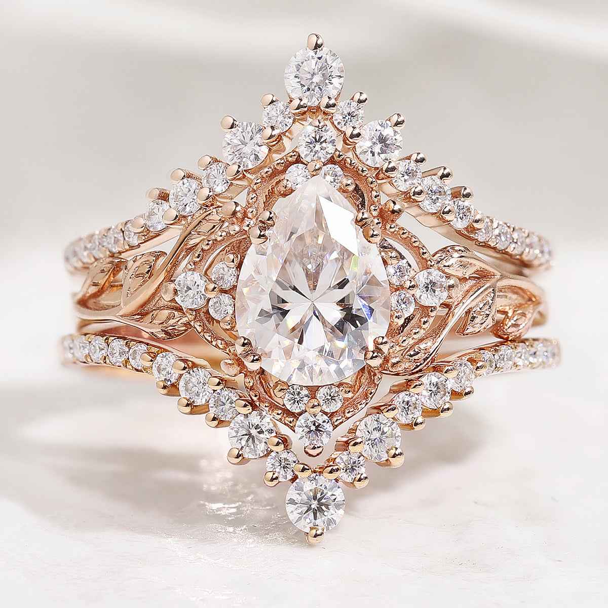
Each cut reflects light in a unique way. Round cuts sparkle consistently; emerald cuts create long, clean flashes. Marquise and pear cuts add direction and energy. Try mixing them—an oval center stone framed by two pears can create a graceful, balanced line that feels both refined and modern.
Mixing Facets: Brilliant, Step, and Mixed
Brilliant cuts throw off light in a dazzling scatter. Step cuts reflect light in broader, quieter sheets. Mixed cuts lie somewhere in between. Placing a brilliant-cut stone next to step-cut accents can emphasize both sparkle and shape. It's this contrast that gives the piece dimension.
Balancing Bold and Delicate Cuts
When combining cuts, not every gem needs to make a statement. A dramatic central stone benefits from smaller, simpler companions. For instance, a large princess-cut amethyst can be tempered by delicate round white topaz, guiding the eye back to your focal point.
Texture, Transparency, and Surface Play
Gemstones also differ in how they handle light and surface texture. These qualities affect the mood of a piece, offering opportunities to mix depth, glow, and clarity.

From Translucent to Opaque: Layering Light
Transparency affects how light passes through a gem. Rose quartz has a soft glow, while lapis lazuli reflects boldly off its surface. Pairing these two creates contrast—not just in lightness, but in feeling. One breathes light; the other holds it.
Raw vs. Polished Stones in One Design
A raw crystal speaks to nature and rough edges. A polished gem, on the other hand, adds shine and formality. When you place them side by side—say, a faceted moonstone next to an uncut peridot—the result feels fresh and organic. These contrasts often give a piece personality and story.
Practical Strategies for Applying Gemstone Design Theory

Moving from idea to finished piece is where instinct meets structure. You can rely on theory, but in the end, it's your eye that decides what works. Use intuition, but check for visual balance.
Start with One Accent Color or Centerpiece
Choose one gem as your main focus. Once that's clear, bring in supporting stones to elevate it—lilac shades around an amethyst, or soft green fluorite to echo purple undertones.
Let the Metal Enhance the Gem Arrangement
Your setting metal can either unify or contrast your stones. Yellow gold warms up rubies. Silver cools them down. Test combinations on a metal base before you commit—it often changes everything.
Follow Instinct, But Refine with Balance
Trust what draws your eye, but always step back. Look at the piece as a whole. If one side feels too heavy or cluttered, shift elements or reduce quantity. Holding it at a distance or photographing it in black and white can help spot imbalances you might miss up close.
What to Avoid When Mixing Gemstones
Knowing what to skip is just as important as knowing what to add. Avoiding common mistakes helps your final piece feel intentional and polished.

- Avoiding Overload and Visual Clutter: Too many elements can drown each other out. If your piece feels noisy, try removing a color or simplifying shapes. Often, subtraction reveals the strongest parts.
- Don't Overlook Durability and Mohs Scale Compatibility: Some gems are delicate. If a soft stone rubs against a harder one, it can chip or scratch. For designs with frequent contact, pick stones with similar hardness levels. Diamonds and turquoise may look beautiful together, but over time, that contrast in toughness becomes a problem.
Showcasing Your Gemstone Designs with Confidence
How you wear, present, or display your finished piece matters. Presentation adds weight to your choices and invites others to engage with your design.

- Designing Jewelry That Reflects Your Personal Style: Gemstones speak—your selection tells a story. Go minimal, bold, earthy, or whimsical. What matters is that it feels like you. Each gem plays a role, and how they interact becomes your signature.
- Organizing and Displaying Your Mixed Gem Collection: Loose stones can inspire new ideas daily—if you store them well. Clear containers, velvet-lined trays, or even simple glass jars make your collection easy to browse. Sort them by hue, mood, or cut—whatever makes you excited to design again.
Let Your Vision Sparkle Through Every Stone
There's no perfect formula for mixing gemstones. It's a matter of noticing relationships—color with cut, light with surface, boldness with softness—and then shaping those into something that feels whole. Over time, your combinations won't just look good. They'll start to feel unmistakably yours.
FAQs
Q1: Can I mix precious and semi-precious stones together?
Yes, combining precious and semi-precious gemstones is not only acceptable but often encouraged in modern jewelry design. The contrast in value or rarity can create visual interest and uniqueness. For example, pairing diamonds with lapis lazuli or sapphires with garnet brings a balance of brilliance and depth. As long as the stones are compatible in terms of hardness and setting, such mixes are both durable and eye-catching. Many contemporary designers use this technique to highlight texture, color, or symbolic meaning rather than focusing solely on cost or classification.
Q2: Do all the stones in one piece need to match in tone?
No, gemstones in a single piece do not need to match in tone. In fact, subtle or bold variations in tone can enhance the overall design. High contrast—such as placing a vivid citrine beside a muted smoky quartz—can create depth and guide the eye across the piece. Designers often use tonal shifts to suggest movement, create visual layering, or reflect emotional contrasts. The key is to maintain visual cohesion by balancing tone with proportion, spacing, and setting style.
Q3: Are there cultural or symbolic rules I should consider?
Yes, many gemstones have long-standing cultural, historical, or spiritual associations that may influence how a design is perceived. For example, jade holds significant cultural value in East Asia, often symbolizing harmony and protection. Turquoise is traditionally used in Native American jewelry to represent strength and healing. When designing for others or for special occasions, understanding these meanings can make the piece more thoughtful and appropriate. It's especially important in wedding, birthstone, or religious jewelry, where the symbolism carries added emotional weight.